If you are reading this, you already know the painful stat: roughly 70% of online shopping carts are abandoned before checkout is completed. The good news? Most of that loss is not about pricing or intent. It is about checkout design. Friction, distrust, and confusion push buyers away at the very last moment.
At CSSMates, we have audited and redesigned checkout flows for dozens of e-commerce brands across Shopify, WooCommerce, Magento, and custom stacks. This guide is a practical walkthrough of the 11 UX patterns we keep coming back to when the goal is to reduce cart abandonment through checkout design. No fluff, no recycled list. Just patterns you can ship this quarter.
Why Checkout Design Drives Abandonment More Than Price
Shoppers who reach the checkout page have already accepted the price. They added the item, opened their cart, and clicked “Checkout”. If they leave now, something in the experience broke their trust or their patience. The most common culprits we find during audits:
- Forced account creation
- Surprise shipping costs revealed too late
- Long, single-page forms with 20+ fields
- No visible progress indicator
- Weak or missing trust signals near the payment button
- Poor mobile input handling (wrong keyboard, no autofill)
Fix these and conversion lifts of 10% to 35% are realistic, based on the projects we shipped in 2025 and early 2026.
The 11 Proven UX Patterns for a High-Converting Checkout
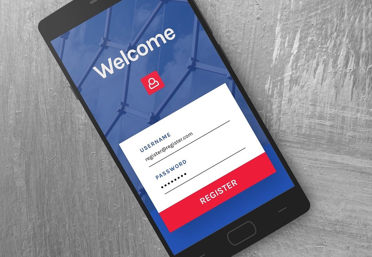
1. Offer Guest Checkout Front and Center
Forcing account creation is the single biggest abandonment trigger we see. Make guest checkout the default visual choice, and offer “Create an account” as a passive checkbox after the order is placed (using the email and password they already entered).
- Place “Continue as guest” as the primary button
- Move “Sign in” to a small text link, not a competing CTA
- Never put a login wall before the email field
2. Use a Visible, Linear Progress Indicator
Users need to know how much effort is left. A 3 or 4 step indicator (Information, Shipping, Payment, Review) reduces anxiety significantly.
| Pattern | Best For | Avoid When |
|---|---|---|
| Multi-step with breadcrumb | Complex products, high AOV | Single-item digital goods |
| Single-page accordion | Simple physical products | Many shipping or tax variables |
| One-page expanded | Returning customer flows | First-time buyers on mobile |
3. Cut Form Fields to the Absolute Minimum
The Baymard Institute benchmark is around 8 form fields for an optimal checkout. Most stores ship with 14 or more. Audit ruthlessly:
- Combine first name and last name into “Full name” when possible
- Auto-detect country from IP, then let users override
- Use address autocomplete (Google Places, Loqate, or native)
- Hide “Company name” and “Address line 2” behind a toggle
- Never ask for phone number unless shipping requires it, and explain why
4. Show Total Costs Early and Honestly
Unexpected shipping or tax fees remain the #1 documented reason for abandonment. The fix:
- Display estimated shipping in the cart, not just at step 3
- Use a sticky order summary on desktop and a collapsible one on mobile
- Update totals in real time as the user changes country or shipping method
5. Smart Input Design for Mobile
Over 65% of checkout traffic is now mobile. A poorly typed credit card field kills conversion instantly.
- Use inputmode=”numeric” for card, CVV, ZIP
- Use autocomplete=”cc-number”, cc-exp, cc-csc attributes
- Format card numbers with spaces as the user types
- Show the correct keyboard for email (type=”email”) and phone (type=”tel”)
6. Inline Validation, Not Submit-Then-Punish
Validate fields when the user leaves them, not when they hit “Place order”. Show green checkmarks for valid fields and clear, friendly error messages anchored to the specific field. Generic errors like “Please check your details” are conversion killers.
7. Trust Signals Where Decisions Are Made
Trust badges work, but only when placed near the action they reassure. Put them next to the pay button, not in the footer.
- SSL or padlock icon near credit card fields
- “30-day return” or “Free returns” microcopy near the CTA
- Recognizable payment logos (Visa, Mastercard, PayPal, Apple Pay)
- A short customer review or star rating in the order summary
8. Express Checkout Above the Fold
Apple Pay, Google Pay, Shop Pay, PayPal, Klarna. Offering these before the form starts can skip 90% of the friction for returning users. Place them at the top with a clear “or pay with card below” divider.
9. Persistent, Editable Cart Summary
Let users see and modify their order without leaving checkout. A common mistake is hiding the cart behind a “View cart” link. Hidden carts make people open a new tab to verify, and that tab often becomes the moment they leave.
10. Reduce Visual Clutter and Exit Points
Remove the main navigation, sidebars, promotional banners, and chat bubbles that auto-open. The checkout page should have one job: complete the order. Keep only the logo (linking back to cart, not home), the steps, the form, and the summary.
11. Save Progress and Recover Gracefully
If a user accidentally refreshes or loses connection, do not start over. Persist form data in local storage. For logged-in or email-captured users, send a recovery link within 30 minutes. The first abandonment email sent under one hour has the highest recovery rate.
Real-World Example: A 22% Lift From Three Changes
One of our DTC clients in the home goods space was running a single-page Shopify checkout with forced account creation. In Q1 2026, we shipped three changes:
- Switched to guest checkout default with optional account creation post-purchase
- Added Shop Pay and Apple Pay above the form
- Moved the trust badges and return policy line directly under the “Pay now” button
Result over 6 weeks of testing: +22.4% checkout completion rate on mobile, +11% on desktop. No discounting involved.

Quick Checklist to Audit Your Own Checkout
| Element | Pass / Fail |
|---|---|
| Guest checkout is the primary option | |
| Total cost (with shipping) visible before payment step | |
| Form has 8 fields or fewer | |
| Mobile keyboards correctly assigned | |
| Inline validation enabled | |
| Express payment options above the fold | |
| Trust signals near the pay button | |
| No header navigation or distractions | |
| Order summary visible at all times |
Frequently Asked Questions
What is a good cart abandonment rate in 2026?
The industry average sits near 70%. A well-optimized checkout typically lands between 55% and 65%. Anything below 55% is excellent. Mobile rates are usually 5 to 10 points higher than desktop.
Should checkout be one page or multi-step?
There is no universal winner. Multi-step performs better for higher-value carts and when many fields are required because it breaks cognitive load. Single-page works better for repeat customers and simple, low-AOV purchases. Test both with your actual traffic.
Do trust badges really increase conversions?
Yes, but placement matters more than the badge itself. Generic badges in the footer do little. Recognizable payment logos and a security icon next to the card fields and pay button consistently move the needle.
Is guest checkout worth losing customer accounts?
You are not losing them. Offer account creation post-purchase using the data they just submitted. Most stores recover 60 to 80% of the accounts they would have gotten through forced signup, without losing the sale.
How fast should the checkout page load?
Under 2 seconds on mobile. Each additional second of load time can reduce conversion by 7 to 10%. Strip third-party scripts from the checkout page aggressively.
Final Thought
Reducing cart abandonment is not about gimmicks or aggressive discounts. It is about respecting the user’s time, removing doubt, and designing a checkout that feels effortless. Pick three patterns from this list, ship them this month, and measure. The numbers will tell you everything.
Need a second pair of eyes on your checkout flow? The CSSMates team runs structured UX audits with prioritized fix lists. Get in touch and we will tell you exactly where your funnel is leaking.